MY DESIGN WORK
THE 4TH RENIASSANCE
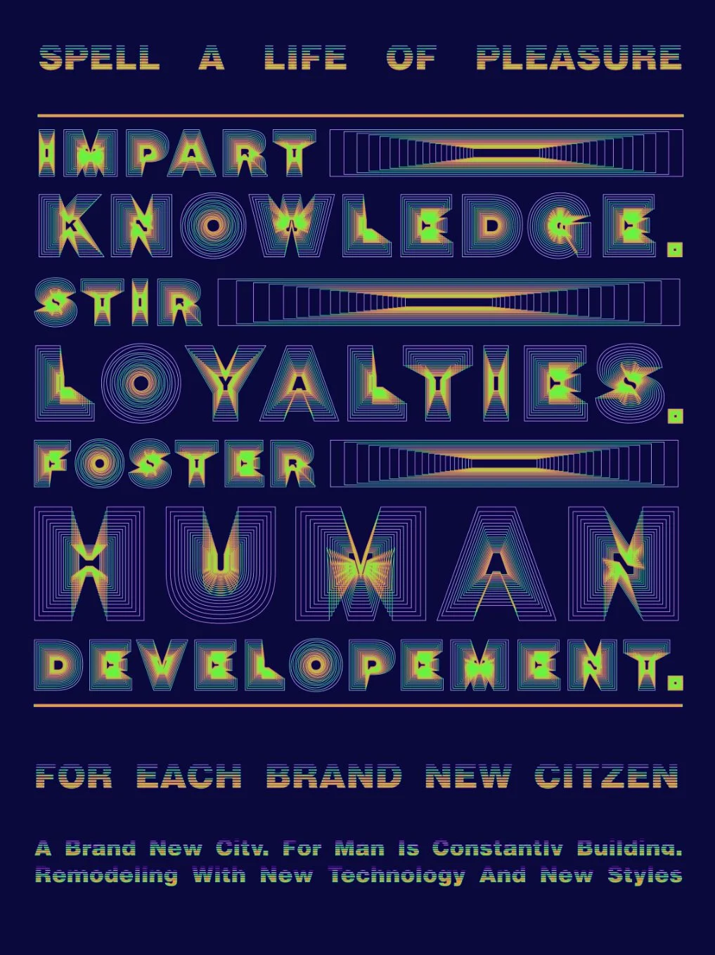
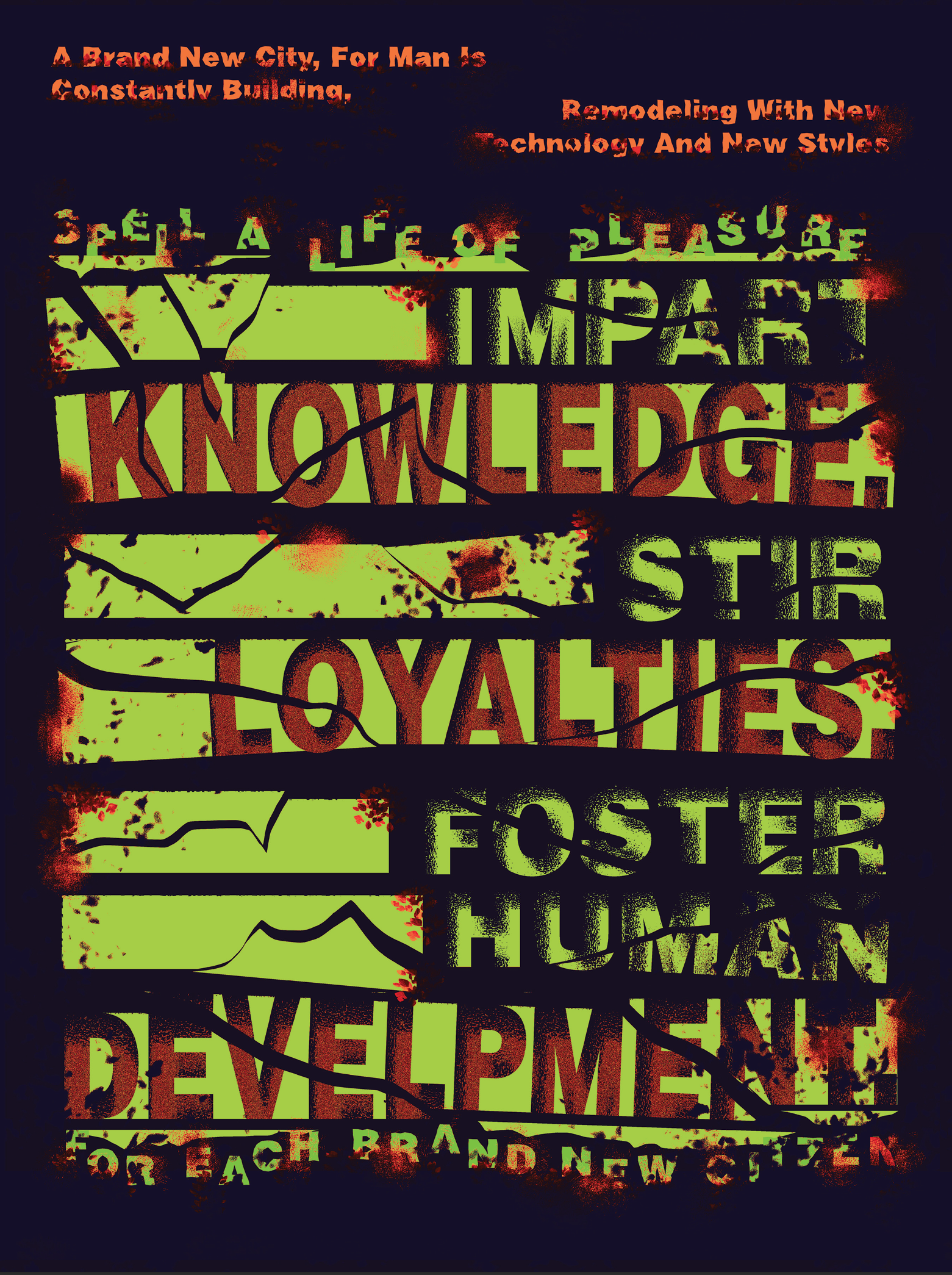
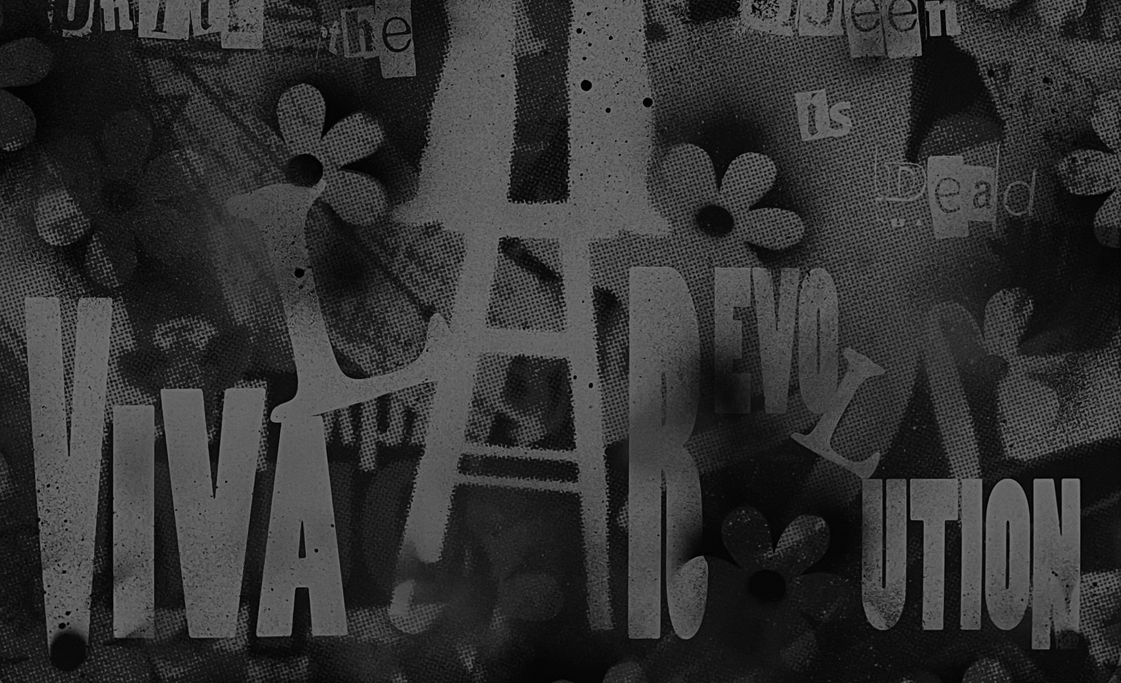
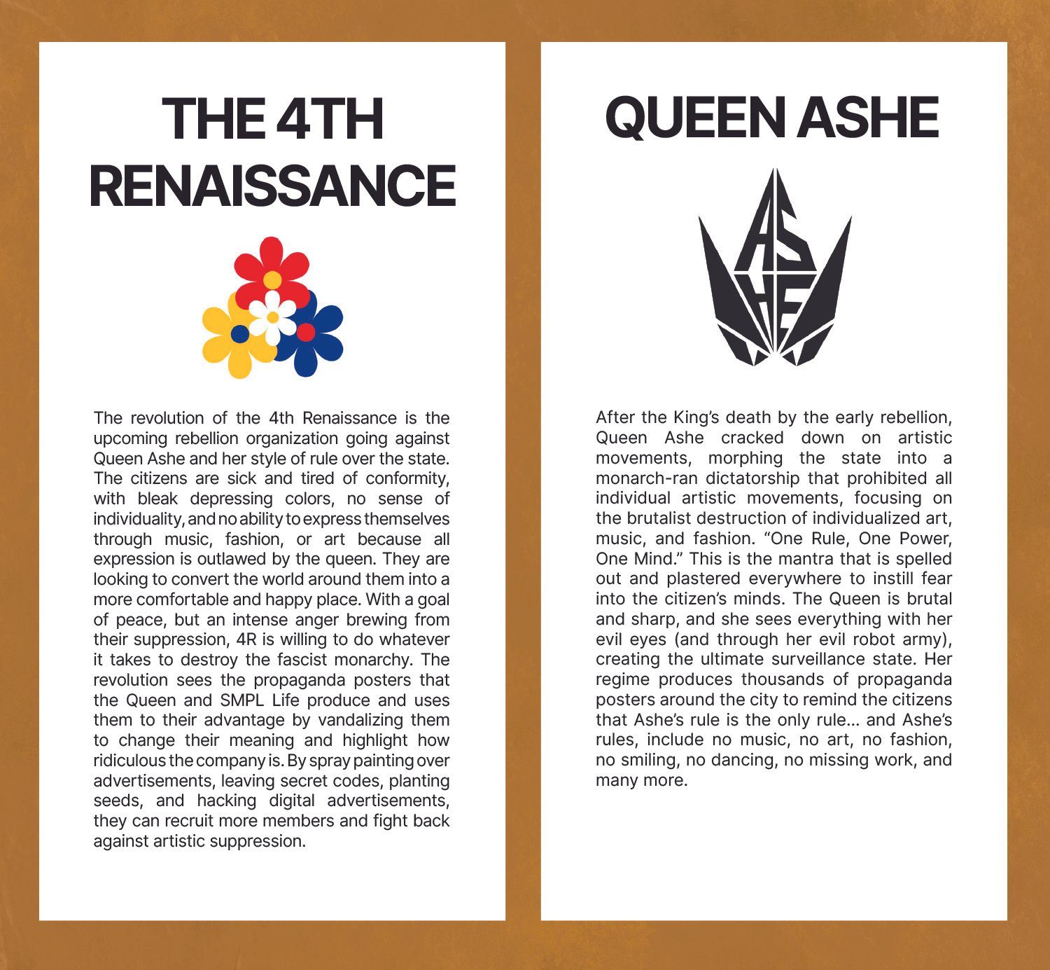
The 4th Renaissance is a futuristic design project that explores a world without expression. In this alternate timeline, an evil and brutalism-loving queen has outlawed all forms of artistic movements including art, music, and fashion. To fight back against these inhumane conditions a revolutionary group called ‘The 4th Renaissance’ stands up against her rule by protesting with creative vandalism and secret forms of communication.
-
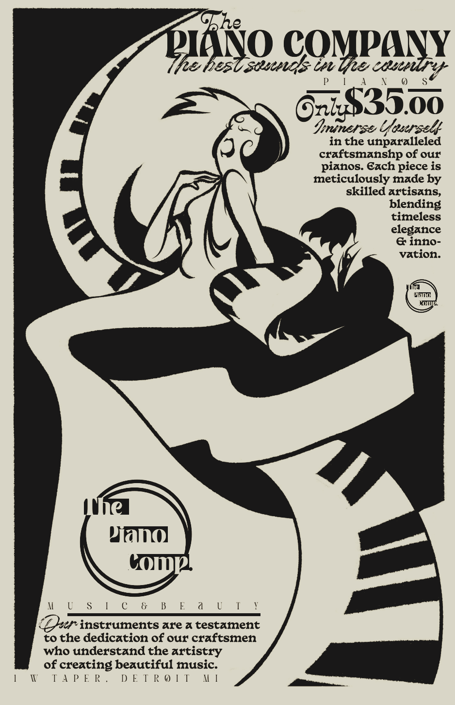
To actualize this world we created three brands: Ashe, the dictator of this world. SMPLife, the monopolized and only company in the city. Lastly, The 4th Renaissance which was our main focus and the revolutionary army.
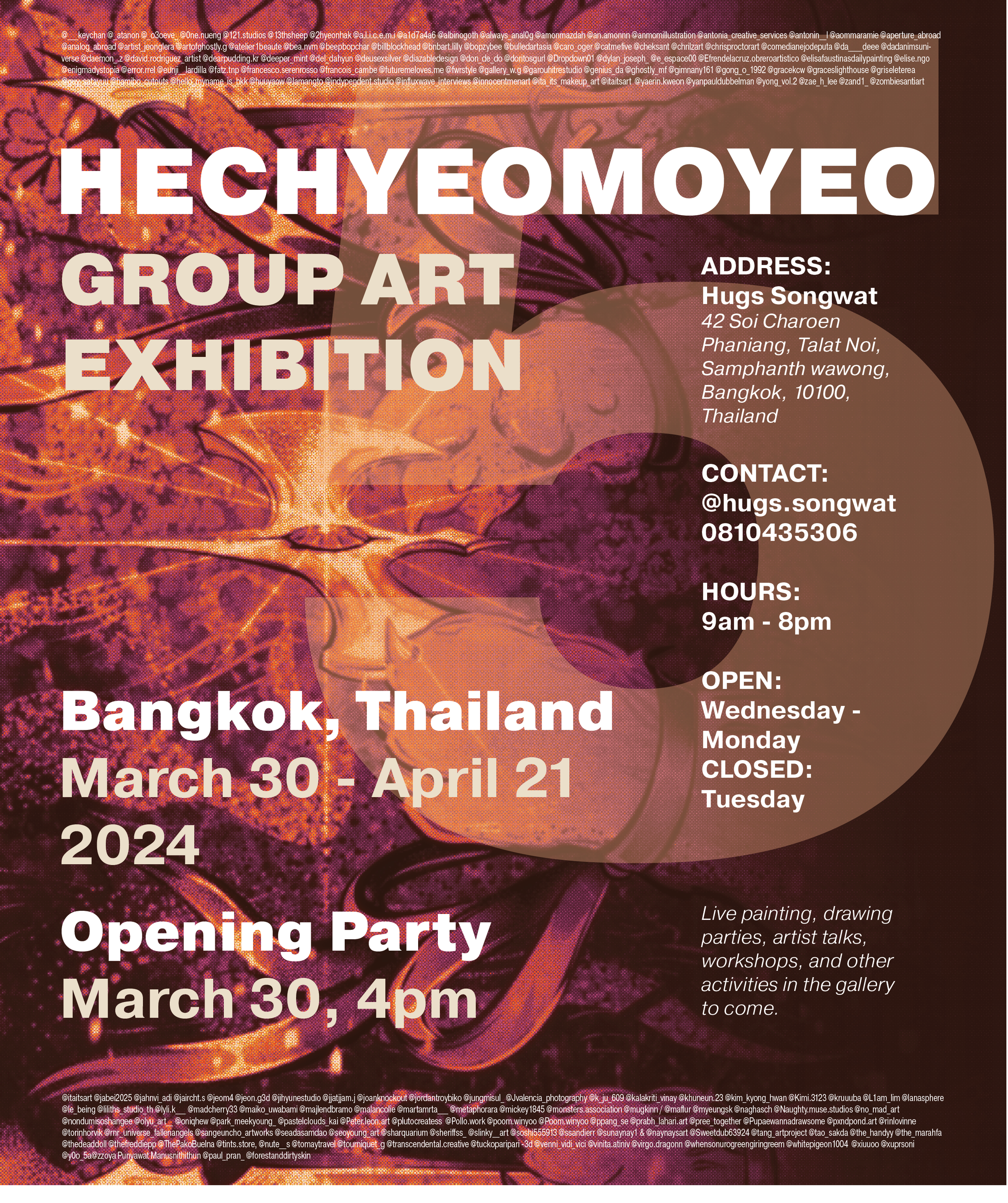
The posters I created represent these three organizations, which were vandalized by the rebels of the 4th renaissance to show the true message of the project. I used physical collage elements and vandalism to aid the design communication of the ideals of our movement and bring a level of realism to our hypothetical future.
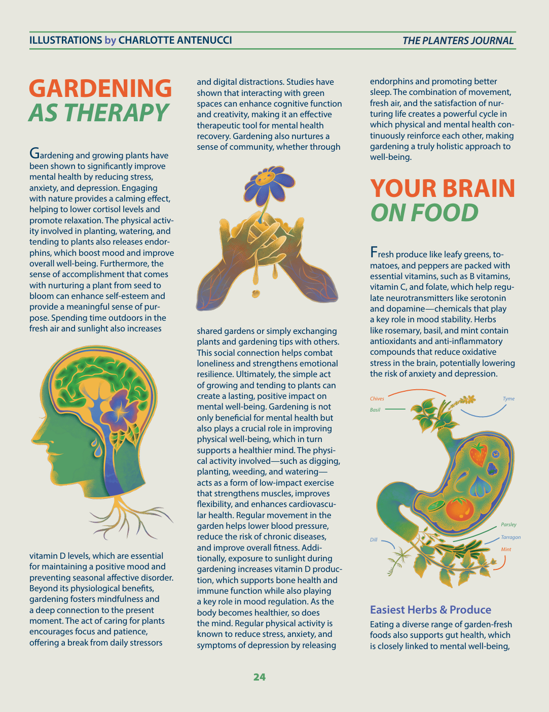
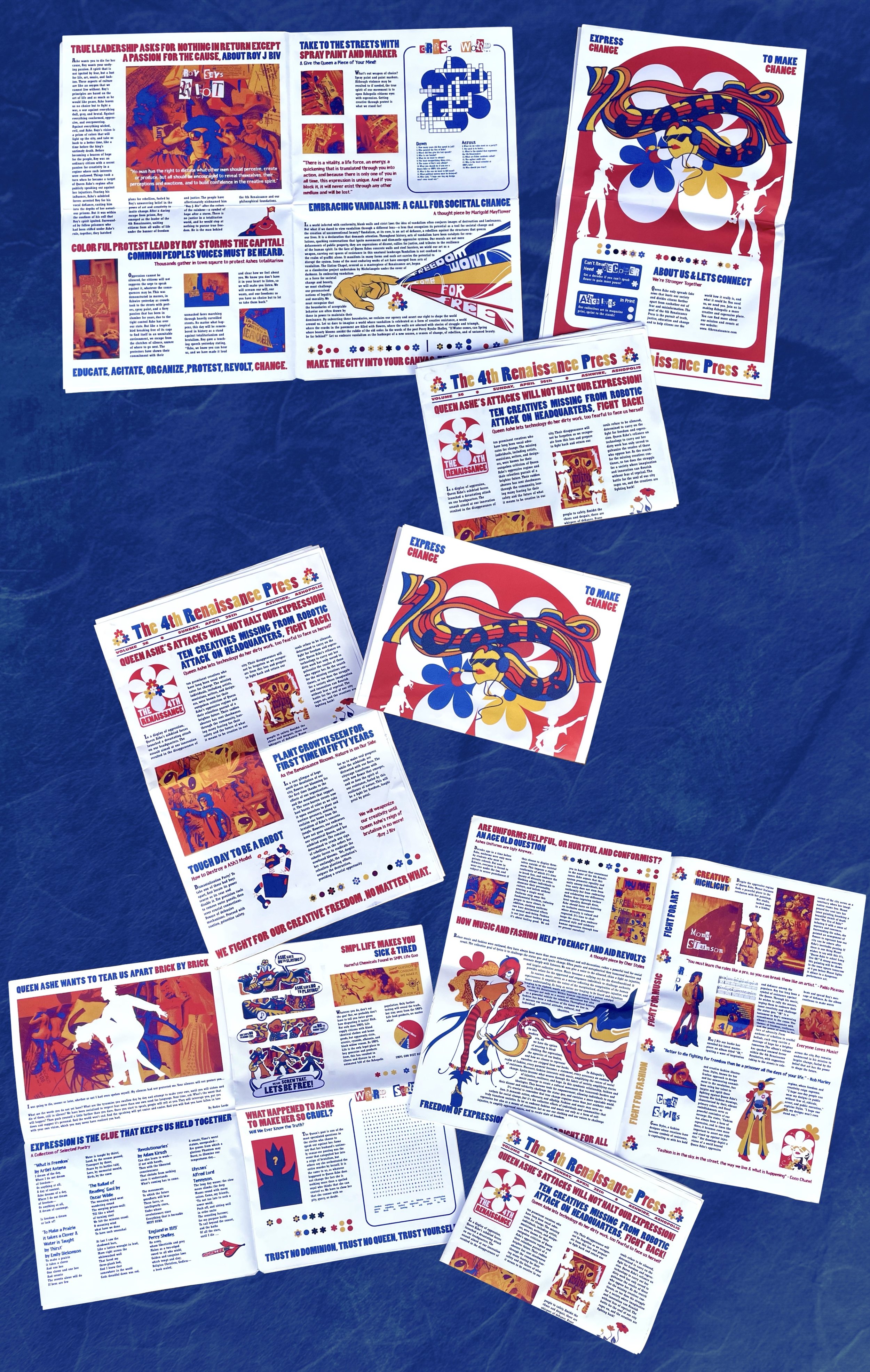
For the revolutionary movement, I designed a newspaper publication that held secret codes of information including crosswords and word searches that revealed messages, and a secret code system of flowers that translated to letters, providing information about protests that would unite the people oppressed by Ashes Regime. This newspaper also includes original comics, collage illustrations, and photographs that aid these ideals.






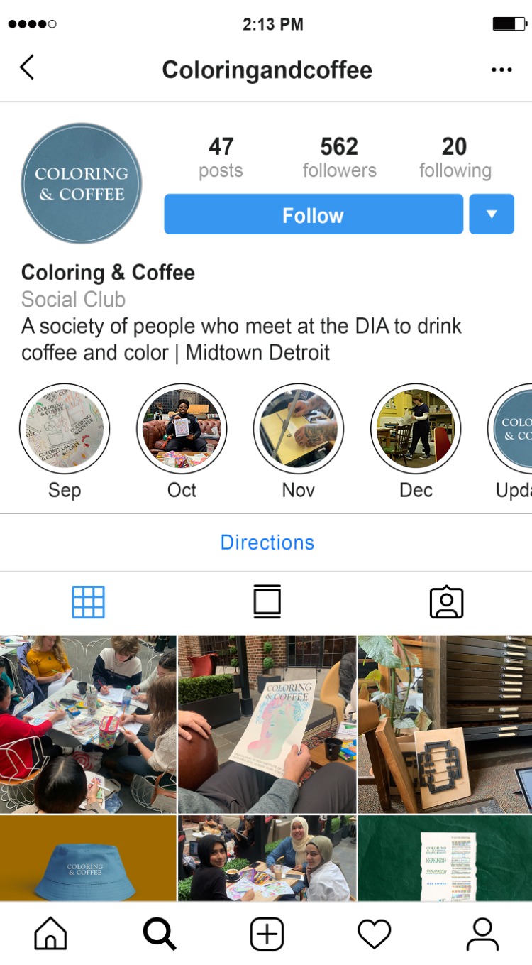
COLORING & COFFEE
Coloring & Coffee is a club that I co-founded, branded, and organized alongside peers at Wayne State University. Our club met monthly at the DIA’s Kresge Court to color, drink coffee, and socialize, and every month our team made new riso posters and letterpress prints at Small Works Detroit.
-
With the club’s name being explanatory of its activities, we used imagery to communicate with our audience. The text format stayed consistent and recognizable, but the new illustrations and graphics we printed kept the posters fresh to our audience. This system maintained a balance between functionality and creativity, which made the printing process pleasant, consistent and efficient. Leaving negative space in the center allowed the audience to color, and for our team to Riso print visually interesting graphics on them. These became the center of attention and engrained the idea of art into the club’s brand. With creative freedom, we did a huge variety of printed designs, utilizing coffee imagery, seasonal elements, and random illustrations.
As a second form of advertising, we created letterpress bookmarks using the fonts Gaudy Bold, and Universal. We thumb-nailed, designed, and typeset the bookmarks to be simple, readable and inquisitive. By mixing ink colors, we created unique shades that represented our brand and hand printed over 500 printed letterpress bookmarks for distribution.
To advertise Coloring & Coffee we placed our prints around campus buildings and student hangouts throughout Midtown to get local traction. We also designed hats, shirts, and a social media platform for further reach.t goes here


